
The Best James Hardie Statement Collection Colours
If you’re considering HardiePlank, here’s an overview of the best standard colours from James Hardie’s Statement Collection, and some thoughts on which ones to avoid!

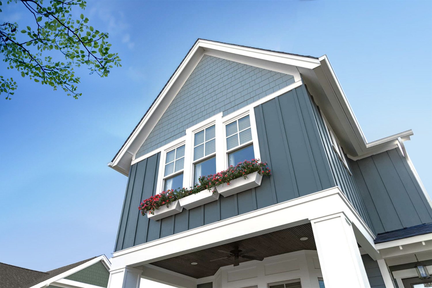
James Hardie | Fibre cement siding offers the charm and beauty of wood without the vulnerabilities and upkeep. Pictured: Fresh Mist shingles and lap siding with Arctic White Trim. PS — a soft yellow door would look great on this home!
Though HardiePlank outperforms other materials in durability, it’s pretty lacking in the colour department (unless you have access to the Dream Collection)! While Hardie does offer primed products that can be custom painted on site, I’m told by installers that this costs significantly more in Canada (and much of the US) — anywhere from 50% to 300% more than a standard ColorPlus product. For this reason, most homeowners choose from the 18 Statement Collection colours.
So what are the best statement collection colours?
If your home is flexible (i.e. NO: masonry, strong roof colour, earthy window colours, etc.), some great bets are Cobble Stone, Arctic White, Boothbay Blue, Evening Blue, Pearl Gray and Light Mist. Pale neutrals are more forgiving and offer better aesthetic longevity than darker neutrals, which tend to get stuck in trend cycles. And the blues are always a timeless choice in Canada and the US!
Navajo Beige, Monterey Taupe, and Aged Pewter can be useful when coordinating with stone; and Mountain Sage and Countrylane Red are classic choices for more traditional suburban homes.
I generally advise against the browns which harken back to the 70s and 2000s. As for those darker greys — they dominated the 2010s and felt flat and uninspired even back then, so I would avoid those as well!
A quick note about exterior colour…
Any colour installed in full daylight exposure will look much lighter than it does inside your house. Be sure to view your samples outside and in a vertical orientation (how your siding will be installed!)
Be sure to get some physical samples from your home improvement store or your installer, or grab a sample pot of a similar colour from your local Benjamin Moore or Sherwin Williams.
RELATED: James Hardie Statement Collection Overview & Paint Colour Matches

These 18 colours make up the James Hardie Statement Collection in BC, Canada. It’s not the most inspired palette, but there are still a few nice colours and combos! Colour and product availability varies by region.
So what colour should I choose?
If you’re working with exterior stone, a strong roof colour, or a masonry driveway…
…those elements will determine your siding colour decisions. For the most updated look, choose the palest neutral that coordinates with your other exterior features.
Consider Cobblestone, Navajo Beige, Pearl Gray, Light Mist, Aged Pewter, or Gray Slate.
If you’re pairing it with traditional red brick…
…a pale neutral or a blue will work best.
Consider Cobblestone, Navajo Beige, Arctic White, Boothbay Blue, or Evening Blue.
If you’re not limited by other bossy elements…
… I highly recommend a colour or pale neutral! Mid-tone and dark neutrals get stuck in trend cycles which end up dating your home. (Think 1990s pink beiges, 2000s browns, 2010s greys, 2020s charcoals & blacks.)
Consider Cobble Stone, Arctic White, Navajo Beige, Pearl Gray, Light Mist, Mountain Sage, Country Lane Red, or any of the blues!
How many colours should I choose for my exterior?
James Hardie has been known to push a three-colour palette, but most homes look better using just one. A multi-colour palette can look great on character homes (and even modern homes) using thoughtfully selected custom colours, but this look is hard to pull off via the limited Statement Collection.
If you really want a two-toned exterior, try using lighter and darker versions of a colour instead. This adds interest while staying within a monochromatic palette — but I recommend installing the lighter colour above the darker colour to best distribute the visual weight.

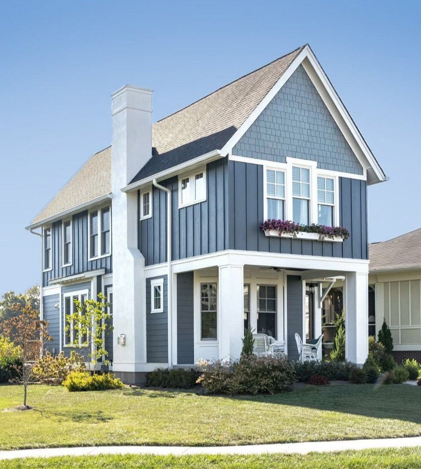
James Hardie | Cobble Stone shingles look great above Khaki Brown horizontal lap. Notice how the siding coordinates beautifully with the stone skirt. However: it’s best to skip exterior stone altogether to save money and maintain flexibility!
James Hardie | Boothbay Blue (gable) and Evening Blue (body) are a lovely, subtle combination.
Can I mix siding styles?
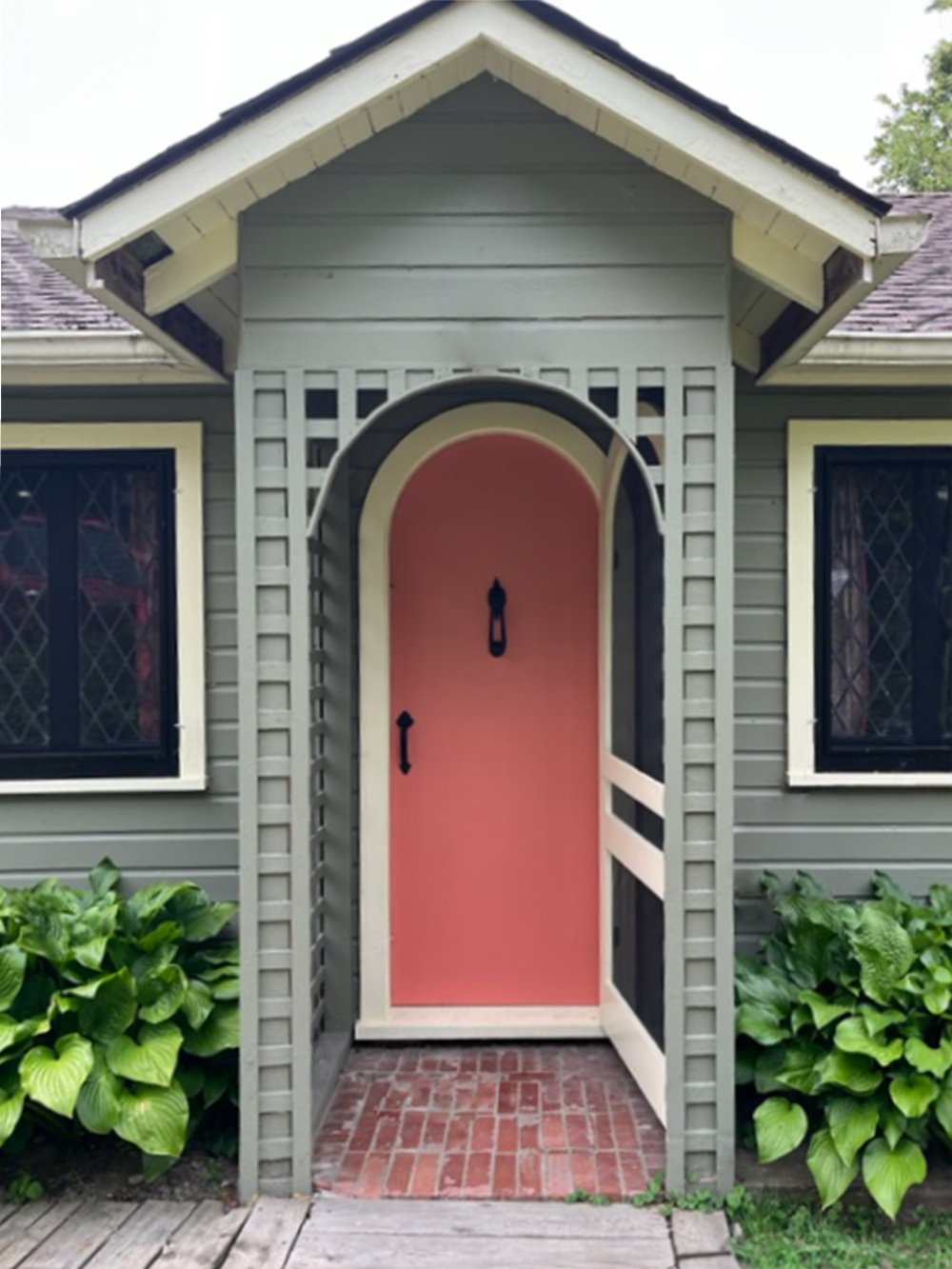
Absolutely! Rather than colour blocking, mixing siding styles is a great way to add interest while maintaining cohesion. For example, depending on your home’s architecture, you could add shakes to your gables / dormers, while using lap siding and/or board & batten on the rest. And remember, your front door is the perfect, low-stakes place to have more fun with colour!
James Hardie | The combination of lap siding (first level), board & batten (second level), and shingles (gable) looks great on this traditional home.
Still need help deciding?
Ideally the inside and outside of your home should flow, so take cues from your interior palette and finishes. You also want to consider the style of your home, the colours of your next door neighbours, and the wider context of your neighbourhood.
If you’re still stumped, I can help you select a siding and trim colour!
Watch on YouTube
Related Articles


Deciding how and when to choose the paint colour for your project can feel very daunting! Learn why choosing your paint colour LAST is the best approach.