
How to PROPERLY Sample Paint Colours
Proper sampling is essential to choosing the right paint colour! It’s crazy how different a colour can look on the wall compared to the chip. This is due to multiple factors including undertone, interreflection, simultaneous contrast, inconstancy… just to name a few! The key is to PROPERLY view LARGE colour samples exactly where they will be installed.
Large-Scale Paint Samples
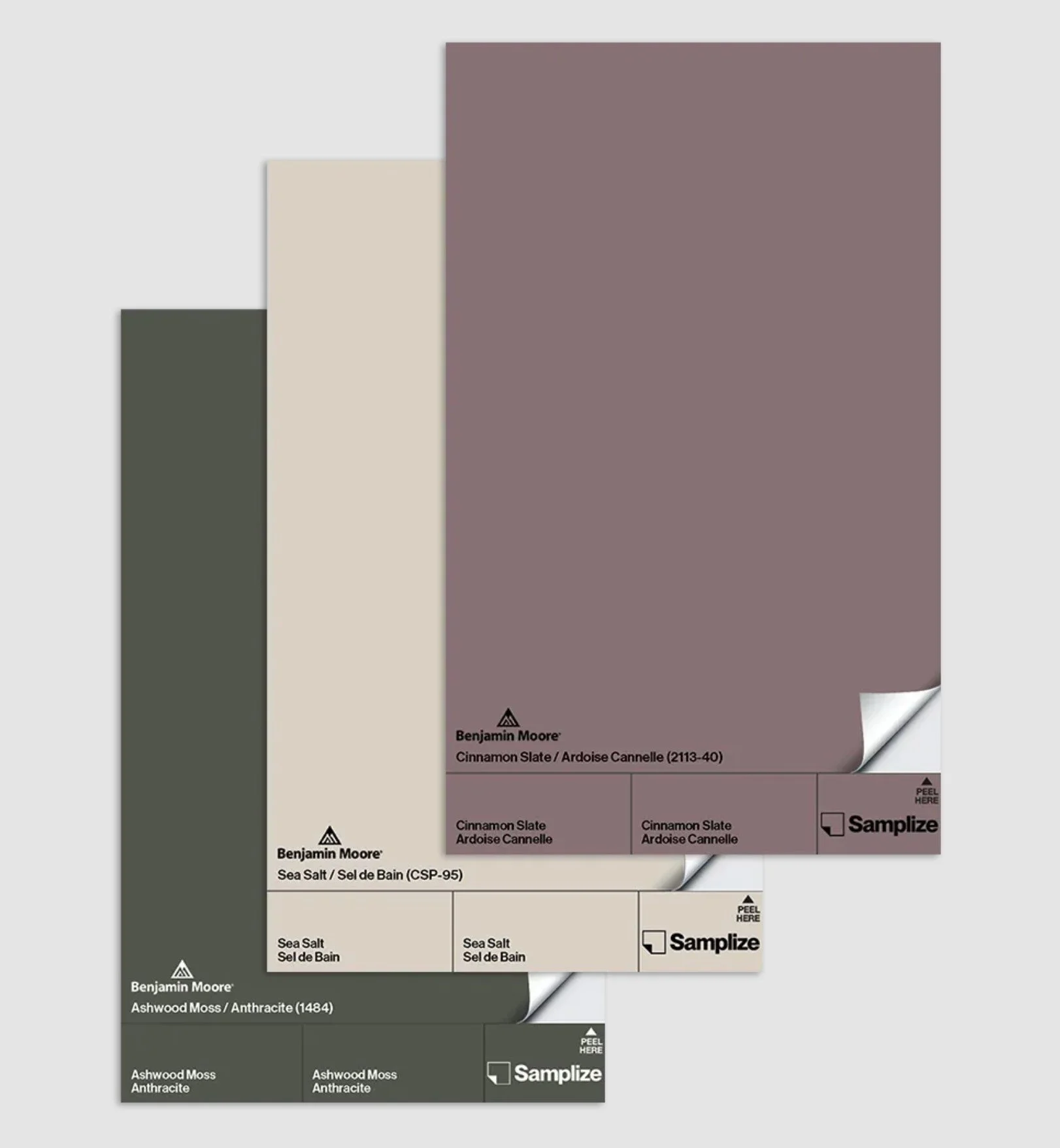
Peel & Stick Samples
Little paint chips from the store just don’t cut it — they’re simply too small to provide an accurate sense of the colour. Once you’ve narrowed down your selection, you can order LARGE peel and stick samples directly from Benjamin Moore and Sherwin Williams, or from a third party like Hello Paint or Samplize.
White Borders
Crucially, you must have a 2-3” white border along three sides of your paint samples. This reduces simultaneous contrast — a visual effect where the appearance of one colour is altered (sometimes significantly!) by a neighbouring colour. This will prevent your new sample colour from being skewed by your current wall colour.
For purchased colour swatches: attach your large sample to a larger piece of white cardstock, aligning one side of the swatch with an edge of the cardstock.
For painted colour boards: tape off a 2-3” border along three sides of your large poster board, then paint all the way to the edge of the fourth side.
Once you have your 3 borders, butt the coloured edge up against whatever the new paint will be adjacent to, e.g. trim work, fireplace stone, artwork, furniture, etc. — NOT floating in the middle of the wall! (SEE BELOW)
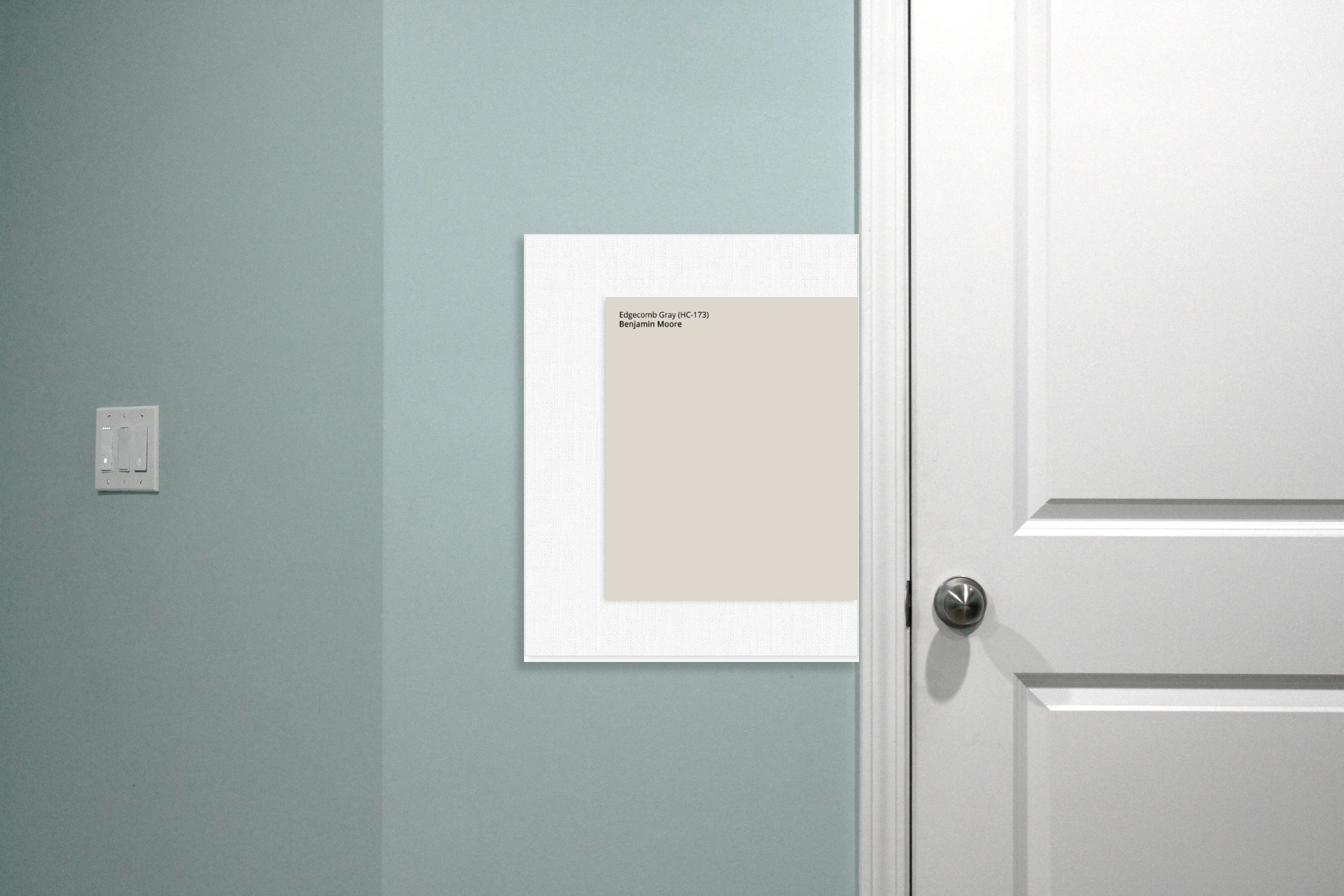
Photo by Shlok Jethwa on Unsplash.
Orientation & Placement
Now, place your samples EXACTLY where you will be painting. If you’re painting a vertical surface (e.g. walls, cabinets, kitchen island, front door, etc.), tape your samples to that surface perfectly vertically – no leaning! *Angle greatly affects light reflection, which changes how a colour looks.)
If you’re painting your a horizontal surface (e.g. floor, ceiling, furniture top, etc.) lay (or tape!) your sample directly onto that surface.
AND MOST IMPORTANTLY: place your samples right up against your other finishes (trim, furniture, etc.) — NOT floating on the wall!!! Contrary to popular practice, it is NOT helpful to post your samples in the middle of the wall where they’re not actually relating to anything in your room.
Lighting
It’s normal for paint to change with the light. If you use your room more often at a certain time of day, observe your samples more closely at that time and make sure everything is coordinating nicely.
If you love a colour during the day but dislike it in the evening, you may just need new lightbulbs! High quality incandescents give you that classic warm glow, but they’re hot and inefficient. I tend to use LED smart bulbs which allow you to adjust BOTH brightness AND colour throughout the day.
But if you want to keep it simple, choose bulbs with a CRI (colour rendering index) of at least 90, and a colour temperature of 3000K (Kelvin) for the most versatile day-to-night light. But if you mostly use your lights at night, go with 2700K bulbs for that warmer glow. The Philips Ultra Definition LED line is a solid, widely available choice.
I know choosing paint colours can be stressful, but following these steps will significantly increase your chances of success. Good luck with your project!
Related Articles


If you find this design advice valuable and you’re able to leave a token of appreciation, I am deeply grateful. Thank you for your support!