Character Cottage with a Coral Front Door
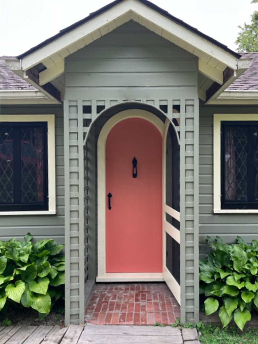
My client and her family have enjoyed their lovely historical lake-front cottage for many years, and it was in need of some TLC. She had recently upgraded the exterior and wanted a pop of colour on the front door to compliment the grey-green siding and original brick entryway.
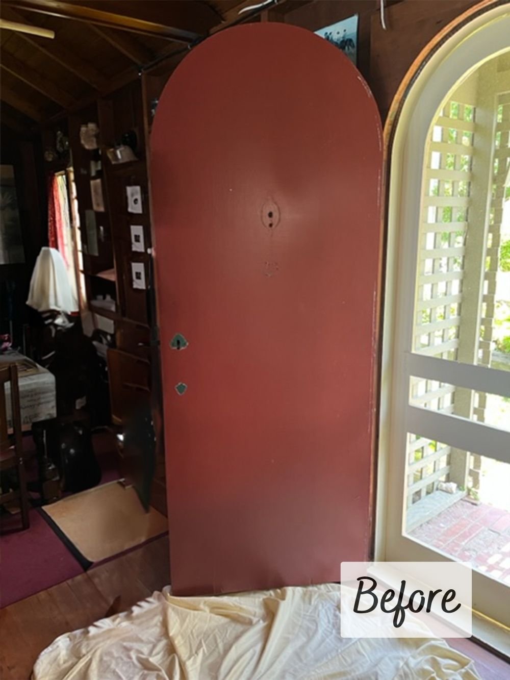
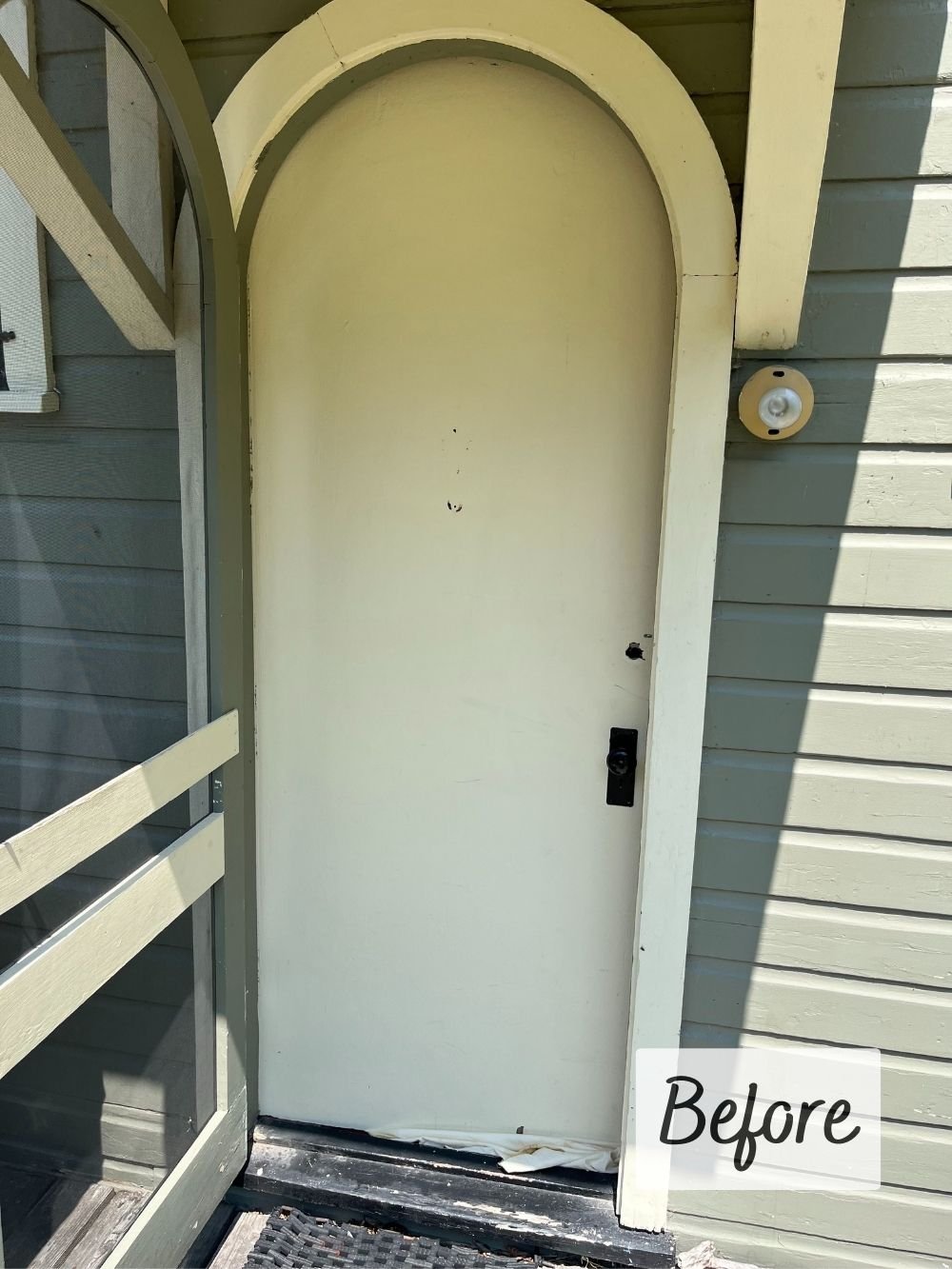
Of the two cottage doors, the front was painted a deep, brick red, while the back was painted cream to match the trim. Though both of these colours were fine, there was definitely room for improvement!
Earthy red and green combos look at best look a lil’ dated, and at worst a lil’ “Christmas”. Wanting to avoid both these scenarios while also honouring the home’s roots, I suggested a lovely coral colour that ticked all the boxes:
✔ worked with the new siding colour
NOTE: it’s okay for front doors to be a little brighter / more saturated than the siding!
✔ coordinated with the fixed element(s), in this case the original brick entryway
✔ gave a nod to the original red door which I knew was important to the family!
And how great does the door look now? Talk about a simple and affordable makeover!
The cottage was spruced up with a simple shift — change doesn’t always have to be dramatic to be impactful! My client and her family love their pretty new doors and will continue enjoying their cottage for years to come.
Related Articles
Redoing your home’s exterior can be a daunting process. If you’re considering HardiePlank, read on for an overview of the best standard colours from James Hardie’s Statement Collection, and some thoughts on which ones to avoid!
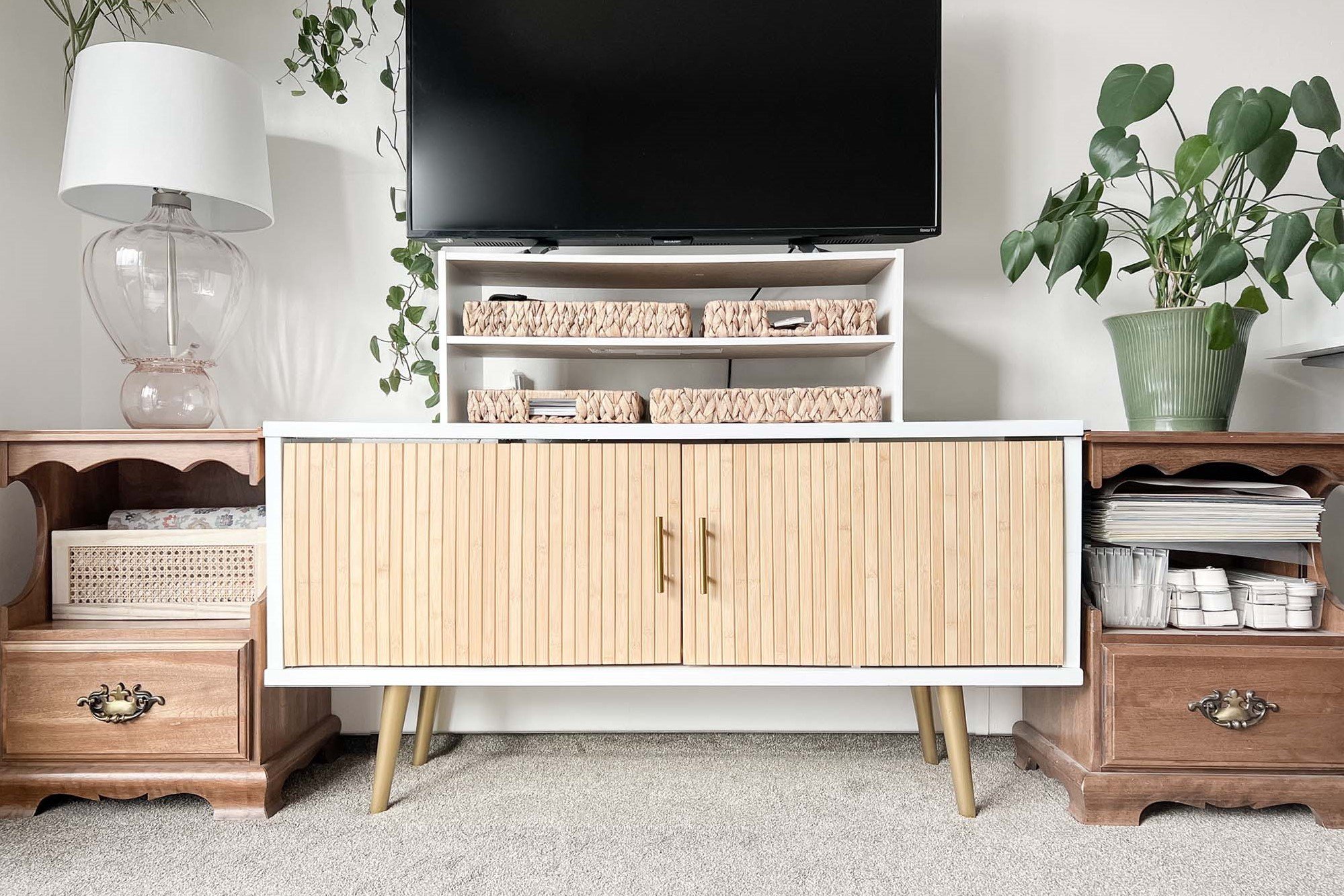
If you have a stretch of wall that needs some love, or if you already have a sideboard and don’t know how to style it, these few rules of thumb can help guide your affordable decorating project! Find out how Caitie created this sideboard vignette for under $300.
Are you reluctant to purchase home decor online, worried it might not turn out as expected? We’ve all be burned by a bad online purchase, but online shopping majorly broadens your design horizons and there ARE a few ways to dramatically increase your chances of success!
Open TV stands are gorgeous in theory, but an eyesore in reality. Housing a menagerie of books, games, cords and accessories, media units should definitely have doors! Find out how a couple of IKEA Rodeby armrest trays became some (very) simple doors using just finishing nails, super glue, and leftover door pulls.
Artwork is one of the best ways to add colour to your home, pull a room together, and fill an empty wall, but it’s also one of the easiest things to get wrong! This post reviews sizing, spacing, heights, framing, and colours to help you choose and hang your art correctly!
Have you heard the word “undertone” but aren’t exactly sure what it means? This post explains its various definitions so you can better understand and use this handy colour term!
This post introduces the Neutral Colour Map, which shows how common neutral colours relate to one another. Neutrals are colours with so little chroma (colourfulness) that they seem to lack colour altogether. However, they nearly all have underlying hues which are important to identify when choosing interior finishes!
This post outlines an easy, step-by-step process for identifying the neutrals and undertones in your home, so you can start building a more cohesive colour palette!
I’m Caitie, and I’m all about making your home more comfortable, functional, and beautiful on a budget!
This post may contain affiliate links, through which I earn a small commission. There is no extra charge for using the links — they simply help support the blog so I can keep providing design advice for free!
Welcome to Design by Caitie, where we make our homes more functional, comfortable, and beautiful on a budget.
Front doors are meant to be colourful! See how a pretty coral front door breathes new life into this historical lake-front cottage.